The allure of a neutral living room lies in its timeless elegance and versatility. Far from being boring, neutral spaces create a canvas for texture, form, and subtle design elements to shine. They offer a sense of calm in our chaotic world, providing a sanctuary where you can relax and recharge. Whether you prefer warm beiges, cool grays, or crisp whites, neutral living rooms adapt to changing trends while maintaining their sophisticated appeal. In this collection, we’ve gathered 30 inspired neutral living room ideas that prove less can truly be more when it comes to color. Each concept blends style and comfort, demonstrating how restraint in palette can lead to the most expressive spaces.
1. Textural Symphony
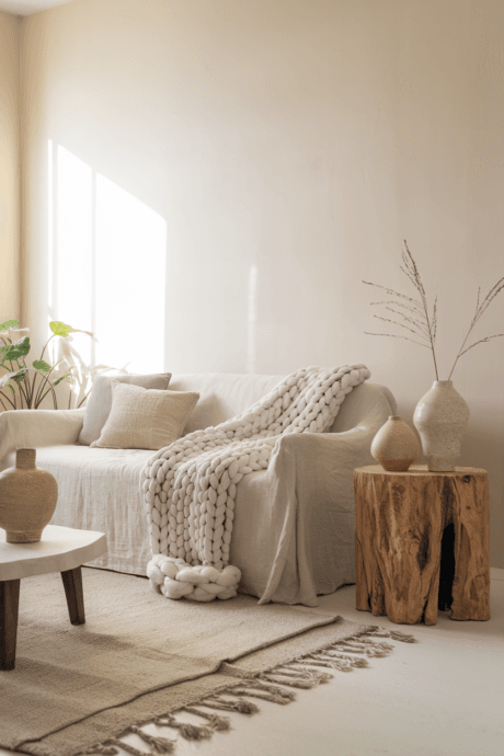
Create depth in a monochromatic space by orchestrating multiple textures in harmony. Layer a chunky hand-knit merino throw across linen-upholstered seating atop a hand-tufted wool rug with subtle geometric patterns. Incorporate matte ceramic vessels alongside polished marble accents and hammered metal decorative objects. This multisensory approach engages touch while maintaining color restraint, proving neutrals can create rich, layered experiences that invite both visual and tactile exploration.
2. Tonal Wood Composition
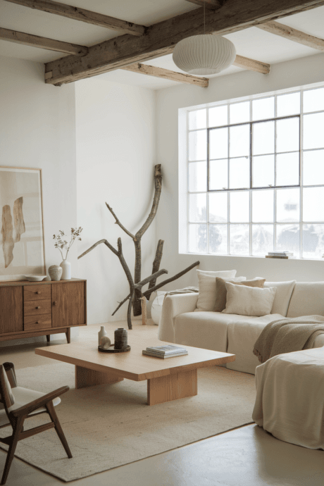
Design a space where wood becomes the protagonist in various finishes and forms. Combine bleached oak flooring with walnut shelving, ash furnishings, and driftwood sculptural pieces. The diverse wood grains create natural pattern while sharing the neutral spectrum. Each wood type brings its own character—ash for elegance, walnut for richness, oak for timelessness—creating an organic narrative that connects your interior to nature’s inherent beauty while maintaining sophisticated restraint.
3. Architectural Illumination
Transform a neutral room with lighting fixtures that function as sculptural art pieces. Install a brass chandelier with sweeping geometric forms, pair with minimalist wall sconces that project light patterns, and add a stone-based floor lamp with linen shade. These lighting elements become focal points while painting your walls with ever-changing shadow play. This approach creates dynamic architectural interest that evolves throughout the day without disrupting the space’s serene palette.
4. Chromatic Whispers
Create sophisticated depth by orchestrating a progression of closely related neutral tones. Begin with ivory walls, transition to creamy upholstery, add wheat-colored accent furnishings, and finish with camel leather details and biscuit-toned textiles. These subtle tonal shifts create a visual rhythm while maintaining harmony. This technique requires precision but delivers spaces with museum-like refinement that appear meticulously curated rather than monochromatic, showing that color restraint yields unexpected richness.
5. Punctuated Neutrals
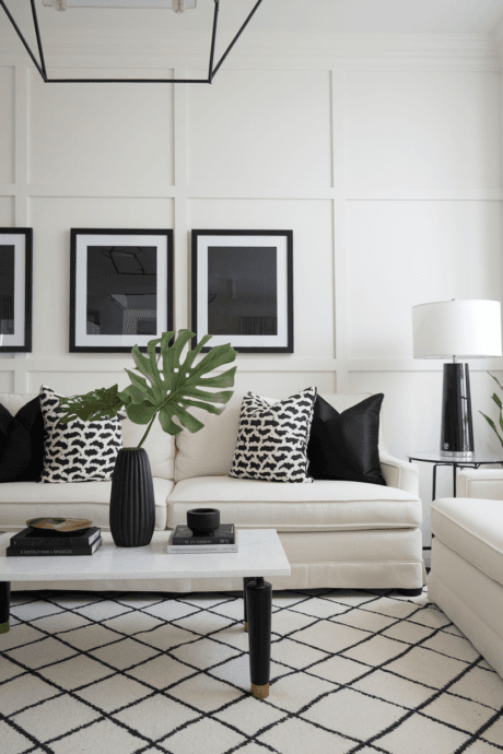
Introduce deliberate contrast with strategic black elements against a pale neutral canvas. Place matte black picture frames, blackened steel table bases, and charcoal ceramic vessels as visual anchors throughout the space. These dark punctuation marks create necessary contrast that helps define the architecture of your room. The careful opposition makes surrounding neutrals appear more luminous and purposeful, bringing definition to spaces that might otherwise feel weightless.
6. Monochromatic Gallery
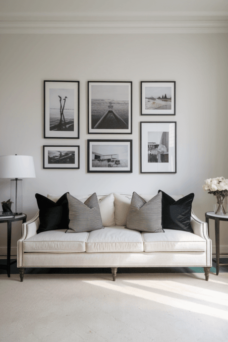
Transform a wall into a curated exhibition with black and white photography, pencil sketches, and minimal line drawings in slender frames. Arrange with generous negative space, creating a composition that breathes. The achromatic artwork complements your neutral palette while adding narrative richness without color disruption. This approach elevates everyday spaces with cultural and artistic references, creating a sophisticated backdrop that engages viewers intellectually while maintaining visual serenity.
7. Form Over Color
Select furnishings where silhouette becomes the primary design element. Choose a swooping curved sofa, an organically-shaped coffee table with unexpected contours, and chairs with distinctive architectural profiles. These statement pieces create a landscape of interesting forms against neutral backgrounds. By prioritizing exceptional design over color, you highlight the sculptural qualities of each piece. This approach transforms furnishings into functional art installations where shape communicates more effectively than hue.
8. Dimensional Surfaces
Apply hand-troweled plaster finishes to walls in soft chalk, bone, or sand tones. The artisanal application creates subtle topography that captures light differently across the surface, resulting in natural shadow play and visual movement. This technique introduces architectural character without pattern or color contrast. The imperfect, timeworn quality references historical building methods while providing a counterpoint to the clean lines of contemporary furnishings.
9. Lived-In Linen
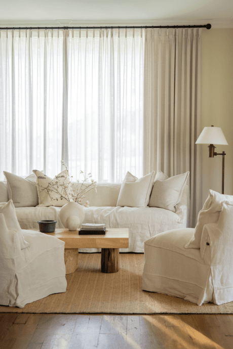
Center your design around the inherent beauty of natural linen in its many forms. Choose a generously proportioned sofa in undyed flax linen, accent chairs in oatmeal tones, and relaxed roman shades in ivory Belgian linen. The fabric’s characteristic irregular weave and subtle variations create immediate visual interest while the gentle rumpling that occurs with use adds character that improves over time. This approach celebrates imperfection and authenticity while maintaining elegant simplicity.
10. Textile Topography

Create dimensional floor interest by layering contrasting neutral rugs. Begin with a large-scale jute or sisal foundation, overlay with a vintage Moroccan Beni Ourain, and top with a small silk or wool accent rug with minimal pattern. This strategic layering defines functional zones while building textural complexity. The intentional overlapping suggests an evolved, collected approach to design while introducing subtle pattern and three-dimensional depth to horizontal planes.
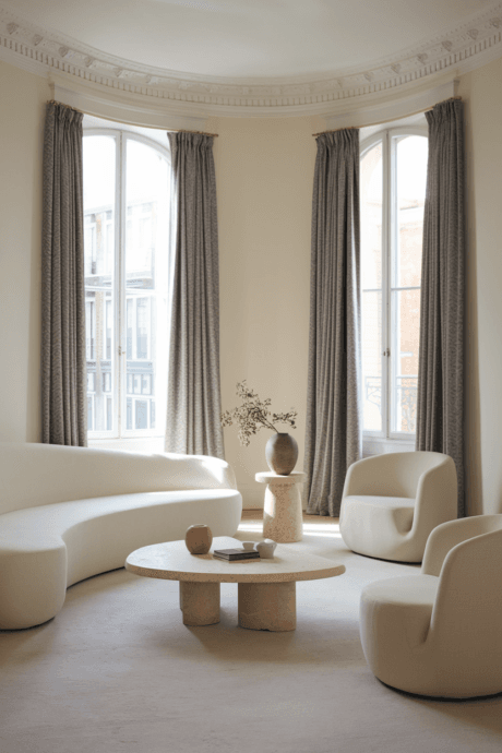
11. Fluid Architecture
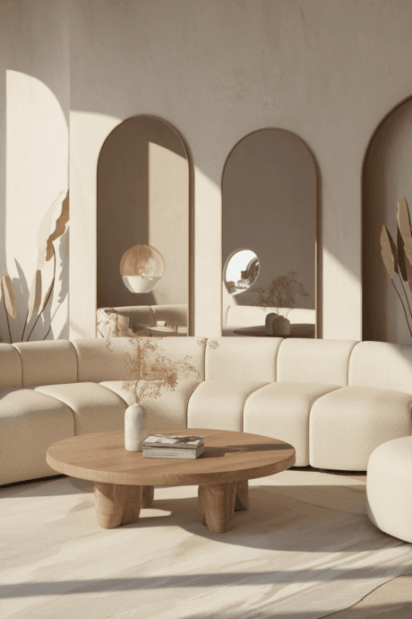
Soften a neutral space with architectural elements that prioritize organic forms. Install arched doorways, curved partition walls, rounded built-ins, and circular windows. Complement with furnishings featuring sweeping lines—a crescent-shaped sofa, cylindrical side tables, and dome-shaped lighting. These flowing forms create natural movement through the space while softening transitions between areas. The curvilinear approach feels inherently natural and restful, creating spaces that guide the eye in graceful arcs.
12. Botanical Structure
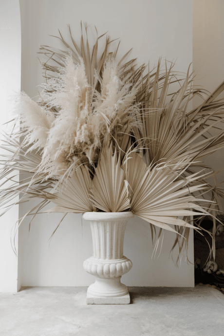
Integrate oversized dried arrangements using bleached or naturally neutral botanical elements. Combine towering pampas grass with dried palm fronds, preserved eucalyptus, and dried lunaria in monumental stone vessels. These sculptural compositions add dramatic height and organic form while maintaining the neutral palette. The preserved elements bring nature’s architecture indoors in a long-lasting format that requires no maintenance while adding vertical dimension and seasonal texture.
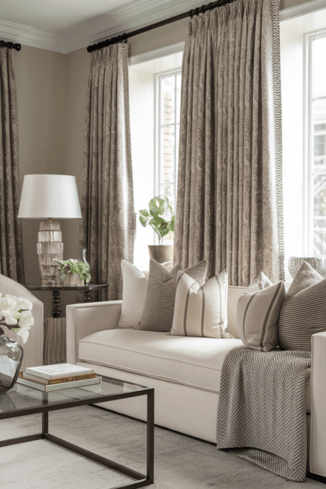
13. Couture Drapery

Install floor-to-ceiling window treatments in heavyweight Belgian linen or wool sateen with architectural detailing—inverted pleats, hidden hardware, and weighted hems. Choose a tone that creates subtle contrast with wall surfaces while maintaining the neutral story. The exaggerated height creates a vertical line that visually extends your ceiling while the substantive fabric adds acoustic benefits. The precise tailoring of these textile elements brings couture-level refinement to architectural openings.
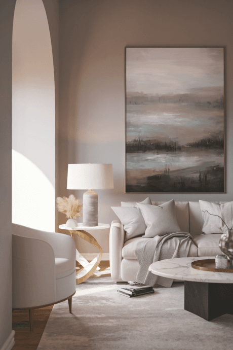
14. Statement Canvas
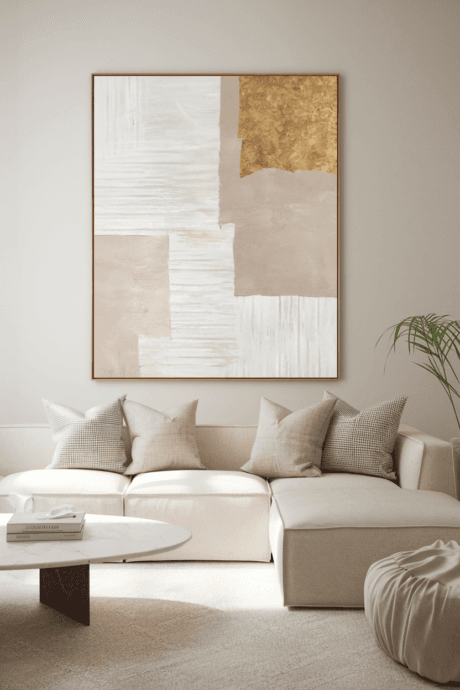
Commission or select an oversized abstract artwork in tonal neutrals with subtle textural elements—perhaps incorporating sand, plaster, or metallic leafing. Position as the dominant focal point in the room, allowing ample negative space around it. The monumental scale creates impact without color intrusion, becoming an architectural element in its own right. This singular artistic statement anchors your design while maintaining the disciplined palette, proving neutral need not mean without artistic expression.
15. Historical Patina
Build your design around a weathered antique carpet in faded, time-softened hues. Select pieces where what were once vibrant colors have mellowed into sophisticated neutral tones through decades of natural aging. The classical patterns provide subtle structure while the patina speaks to history and authenticity. These textile artifacts ground contemporary elements with their inherent soul and narrative quality, creating spaces that feel timeless rather than trendy.
16. Metallic Composition

Orchestrate a careful arrangement of diverse metal finishes throughout your space. Combine satin brass lighting fixtures with blackened steel architectural elements, burnished bronze decorative objects, and pewter hardware accents. The varied reflective qualities of each finish interact uniquely with light throughout the day, creating subtle shimmer and depth. This metallic counterpoint to soft textiles introduces necessary structure and architectural definition without relying on color contrast.
17. Tactile Walls
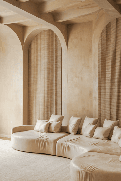
Transform wall surfaces with dimensional coverings like hand-woven grasscloth, pleated linen, or sueded cotton in biscuit, greige, or alabaster tones. These specialized treatments elevate flat surfaces into multidimensional experiences that change under different lighting conditions. The tactile quality invites interaction while maintaining neutral discipline. This approach brings warmth and intimacy to spaces that might otherwise feel austere, wrapping rooms in textural complexity that creates visual interest through touch rather than color.
18. Conversation Pit
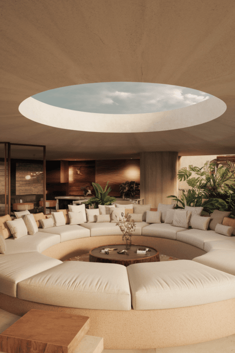
Create an intimate sunken seating area with built-in sofas in soft neutral upholstery. This architectural feature becomes the heart of your living space, encouraging connection and conversation. The lowered elevation creates inherent coziness while the continuous seating maximizes social interaction. This retro-inspired feature feels newly relevant in today’s home-centered lifestyle, creating a distinctive layout while maintaining a calm, neutral aesthetic.
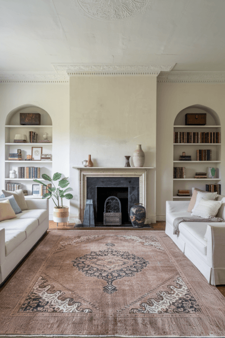
19. Monochromatic Book Display
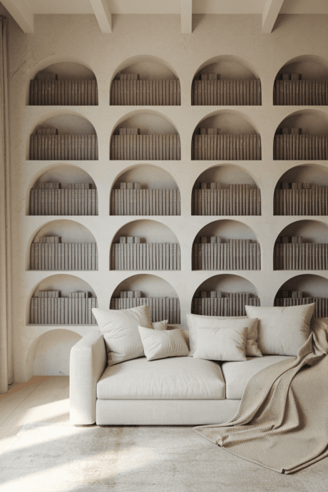
Arrange books with the spines facing inward or covered in neutral paper to create a textural display that maintains your color scheme. This unconventional approach transforms books from potential color disruptions into sculptural elements with uniform tonality. The resulting display highlights the physical form of books as objects rather than their covers, creating a conceptual art installation from everyday items.
20. Limestone or Concrete Elements
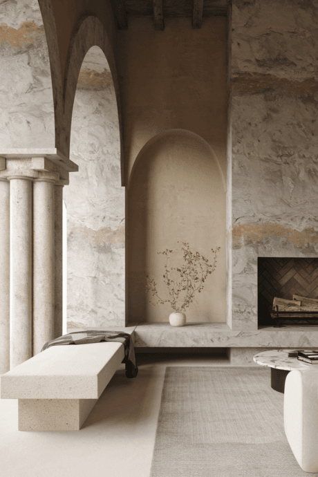
Incorporate architectural elements in limestone, concrete, or plaster – perhaps a fireplace surround, built-in bench, or decorative wall panel. These materials add mineral character and subtle color variation within the neutral spectrum. Their cool, substantial presence balances softer elements and connects indoor spaces to architectural traditions. The slight imperfections and natural variations in these materials add authenticity that manufactured surfaces often lack.
21. Preserved or Dried Botanical Elements
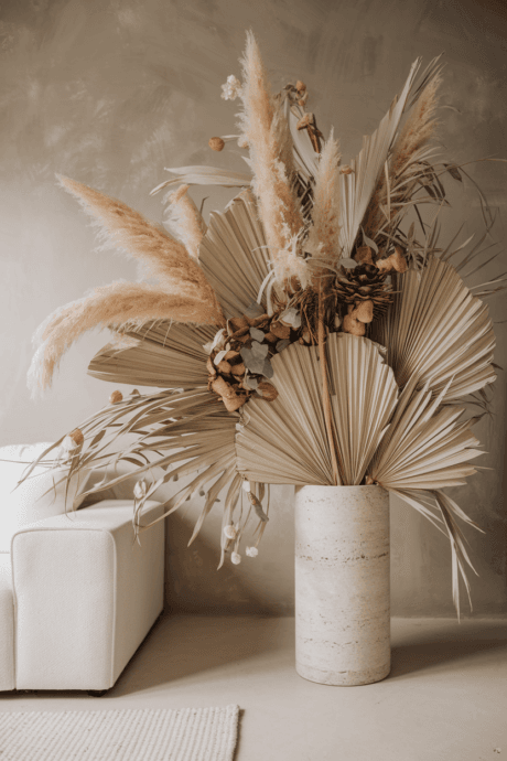
Arrange dried pampas grass, bleached eucalyptus, or preserved palms in oversized neutral vessels. These long-lasting botanical elements add organic shape and subtle texture without the maintenance of fresh flowers. Their naturally neutral coloration perfectly complements your palette while their sculptural forms add height and movement. This approach brings nature indoors in a sustainable way that evolves gracefully over time.
22. Architectural Salvage
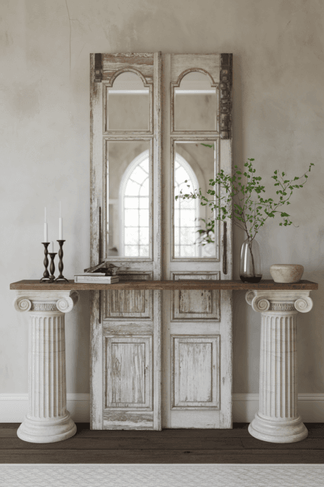
Incorporate reclaimed architectural elements like weathered doors repurposed as tables, antique columns as pedestals, or vintage moldings as wall décor. These pieces bring history, character, and craftsmanship while their aged finishes naturally inhabit the neutral palette. The patina of use tells stories that new items cannot, adding narrative depth to your design. These conversation pieces become anchors in your space, lending authenticity and unique character.
23. Tonal Pattern Play
Introduce subtle patterns in the same color family – perhaps a tone-on-tone striped pillow, a textured herringbone throw, and a faint damask curtain. When patterns share the same hue, they create dimension without chaos. This technique adds visual complexity while maintaining the serenity of your neutral scheme. The layered patterns create a sophisticated backdrop that reveals itself gradually rather than announcing its presence, rewarding closer observation.
24. Japanese-Inspired Minimalism
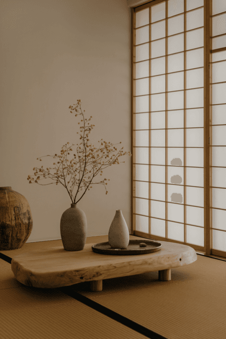
Embrace the principles of Japanese minimalism with low-profile furniture, uncluttered surfaces, and carefully curated objects in natural materials. This approach celebrates empty space as a design element rather than a void to fill. The resulting atmosphere feels intentionally peaceful rather than accidentally sparse. This philosophy elevates neutrals from a mere color choice to a holistic approach to living with greater awareness and less distraction.
25. Hidden Technology
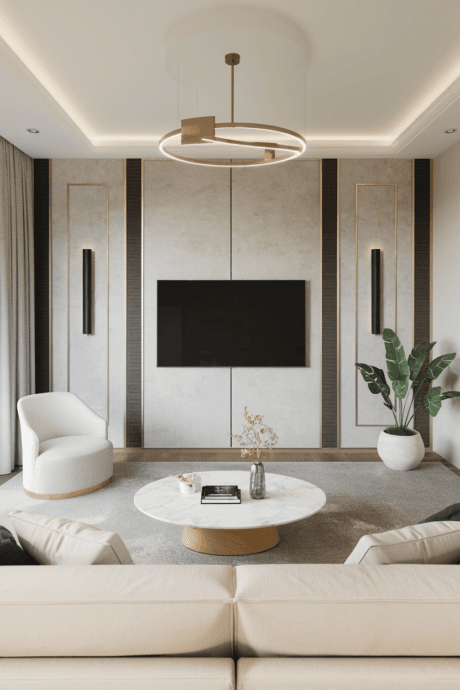
Conceal televisions and speakers behind art panels, within custom cabinetry, or through projector systems that disappear when not in use. This approach maintains visual tranquility by hiding potentially disruptive black screens and plastic components. The technology serves your needs without dominating your aesthetic, allowing the neutral palette and intentional design elements to take precedence. This creates a space that facilitates both connection and entertainment without visual compromise.
26. Leather Accents
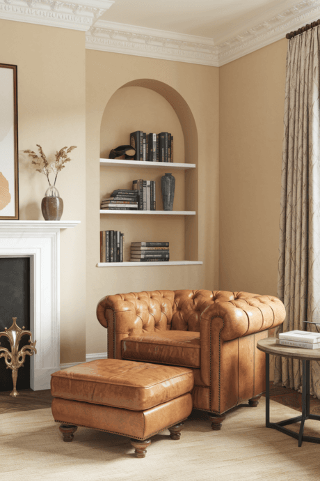
Incorporate natural leather elements in caramel, taupe, or greige tones. A leather pouf, chair, or collection of books with leather spines add warmth and natural patina. Leather’s ability to age beautifully makes it perfect for neutral spaces focused on timelessness rather than trends. The material brings a masculine edge that balances softer elements, creating tension between different tactile experiences that makes a space feel complete and considered.
27. Venetian Plaster
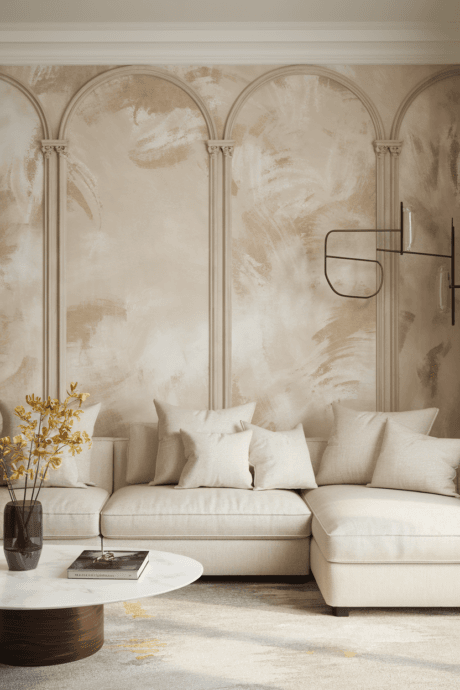
Apply polished Venetian plaster in ivory, soft gray, or pale taupe for walls with subtle luminosity and depth. This ancient technique creates surfaces with visual movement and a slight sheen that changes with different lighting conditions. The hand-applied finish ensures every wall is unique, with subtle variations that cannot be replicated by machine. This investment in craftsmanship elevates your entire space, creating a backdrop of quiet luxury.
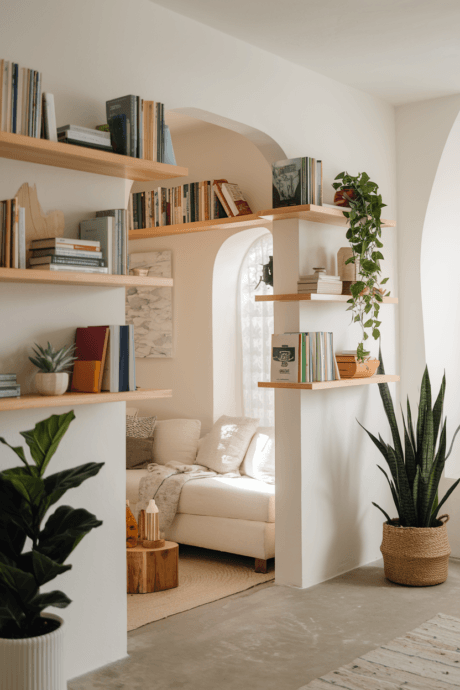
28. Floor-to-Ceiling Neutral Library
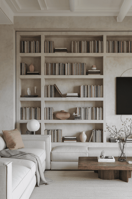
Transform a wall with built-in shelving filled with books wrapped in neutral paper, objects in complementary tones, and negative space for visual breathing room. This architectural feature adds tremendous character while maintaining your color discipline. The resulting composition becomes both functional storage and a major design element, lending gravitas and intellectual dimension to your space while the uniform covering creates visual cohesion.
29. Asymmetrical Arrangements

Create dynamic tension through intentionally asymmetrical furniture arrangements and art installations. Balance visual weight rather than seeking perfect symmetry, which can feel static. This contemporary approach feels more organic and lived-in than traditional formal layouts. The resulting space has energy and movement despite its neutral palette, proving that composition rather than color can create excitement and interest in interior design.
30. Fog-Toned Color Story
Develop a palette inspired by coastal fog, with soft grays, pale blues, and lavenders so subtle they read as neutrals. These barely-there hues suggest color without committing to it, creating an ethereal, dreamlike quality. The resulting atmosphere feels both calming and slightly mysterious, with a painterly quality reminiscent of Turner’s landscapes. This approach softens the potential starkness of true neutrals while maintaining their serene, timeless quality.
Final Thoughts
Neutral living rooms offer endless possibilities for sophisticated, timeless design. By focusing on texture, form, and subtle variations in tone, these spaces achieve richness and character without relying on bold color. The beauty of a neutral palette lies in its ability to highlight exceptional craftsmanship, architectural details, and the quality of natural light in your home. It creates a backdrop that adapts to seasonal changes, evolving tastes, and different occasions with graceful ease.
Remember that neutral doesn’t mean devoid of personality – rather, it’s a deliberate choice that elevates the conversation between objects, textures, and negative space. The most successful neutral rooms feel intentional rather than safe, curated rather than bland. They invite touch as much as visual appreciation, engaging multiple senses through material variety and thoughtful layering.